FlyDelta x Google Maps | UI/UX Mashup
A collaboration of the existing FlyDelta and Google Maps app. I leveraged Google Maps’ features and technology to enhance traveler’s navigation experience within the FlyDelta app. This project aims to streamline the airport-to-destination transition, targetting travelers and their needs within a single app.
UI/UX Design | UX Research
UI/UX Design | UX Research
Team
Individual
Individual
Duration
4 Weeks
Fall, 2023
4 Weeks
Fall, 2023
Programs
Figma
Figma


Problem Space
In many cities, public transportation services do not reach airports, making it difficult for travelers to transition between public and airport transportation due to a major disconnect between the product services offered.
Services like Google Maps may lack essential information, like baggage services, wheelchair accessibility, and crowd levels, hindering travelers’ to make an informed transportation decision aligned with their specific needs. Services like FlyDelta provide airport navigation but leave travelers to arrange transportation beyond the airport independently.
This project aims to combine the two services to create a seamless travel experience.
How might we create awareness of available transportation options so that travelers can make an informed decision on the best mode of transportation for their needs?
Set Your Scenario
After entering a destination, users can tailor their recommended routes and information by entering their particular travel scenario.
Traveler information in the next screen would be tailored to their needs based on what they picked.
Recommended Routes
From each recommended route, users can view specific information, including baggage storage if they chose Medium to High level of baggage, elevator availability if they have accessbility needs, crowd levels, and other information tailored to their particular travel scenario.
Live User Updates
Receive live updates from other users based on set scenario.
For example, if a user selects wheelchair accessibility, they would see live input like, “This exit has elevators and ramps,” from others who have previously navigated the route.
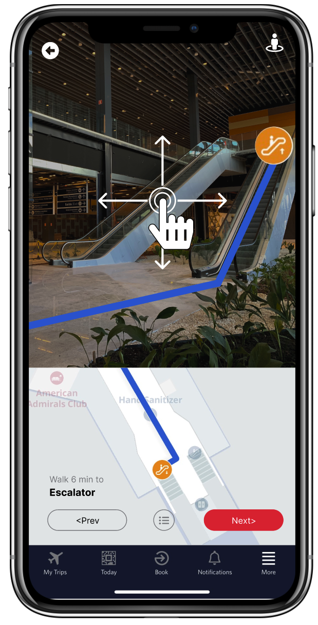
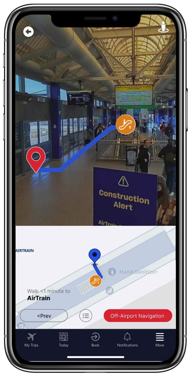
Indoor View
Use Indoor View scans to preview selected areas, making navigation easier. This allows users to plan their route in advance, verify their location by comparing their surroundings with Indoor View, and search for specific facilities—like ATMs—that may not appear on the standard map.

Survey
A survey was conducted to better understand how users navigate both inside and outside the airport, their reasons for choosing specific methods, and the challenges they face with their preferred mode of transportation. These were the top insights:
1. Default methods of transportation are too expensive
2. Users are unaware of other transportation options
3. The disconnect between airport and public transit services drives users toward Uber/Lyft due to public transit’s high learning curve.

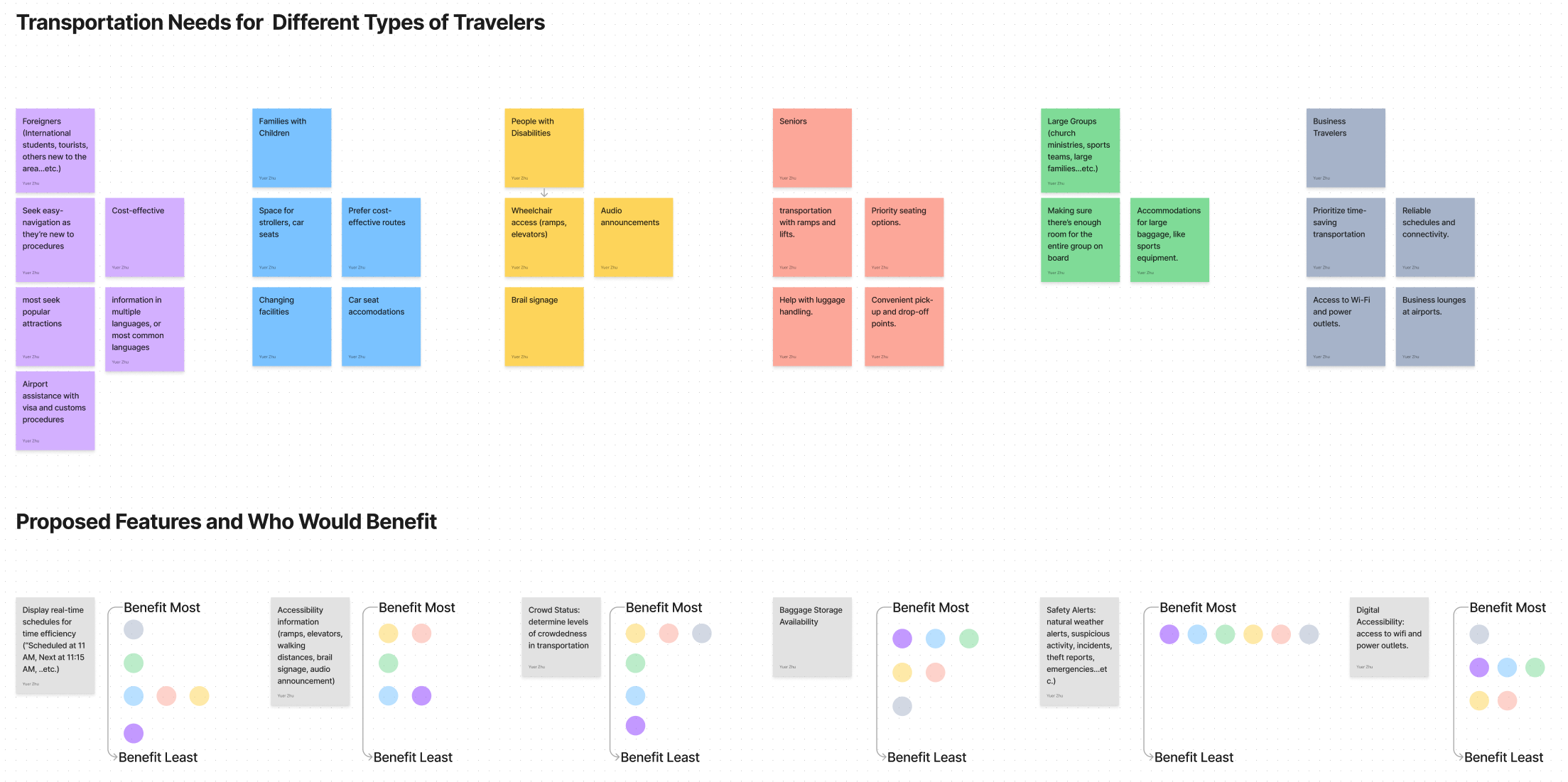
Affinity Clustering
Transportation needs for different types of travelers were identified. Proposed features were ranked based on how much each traveler type would benefit.
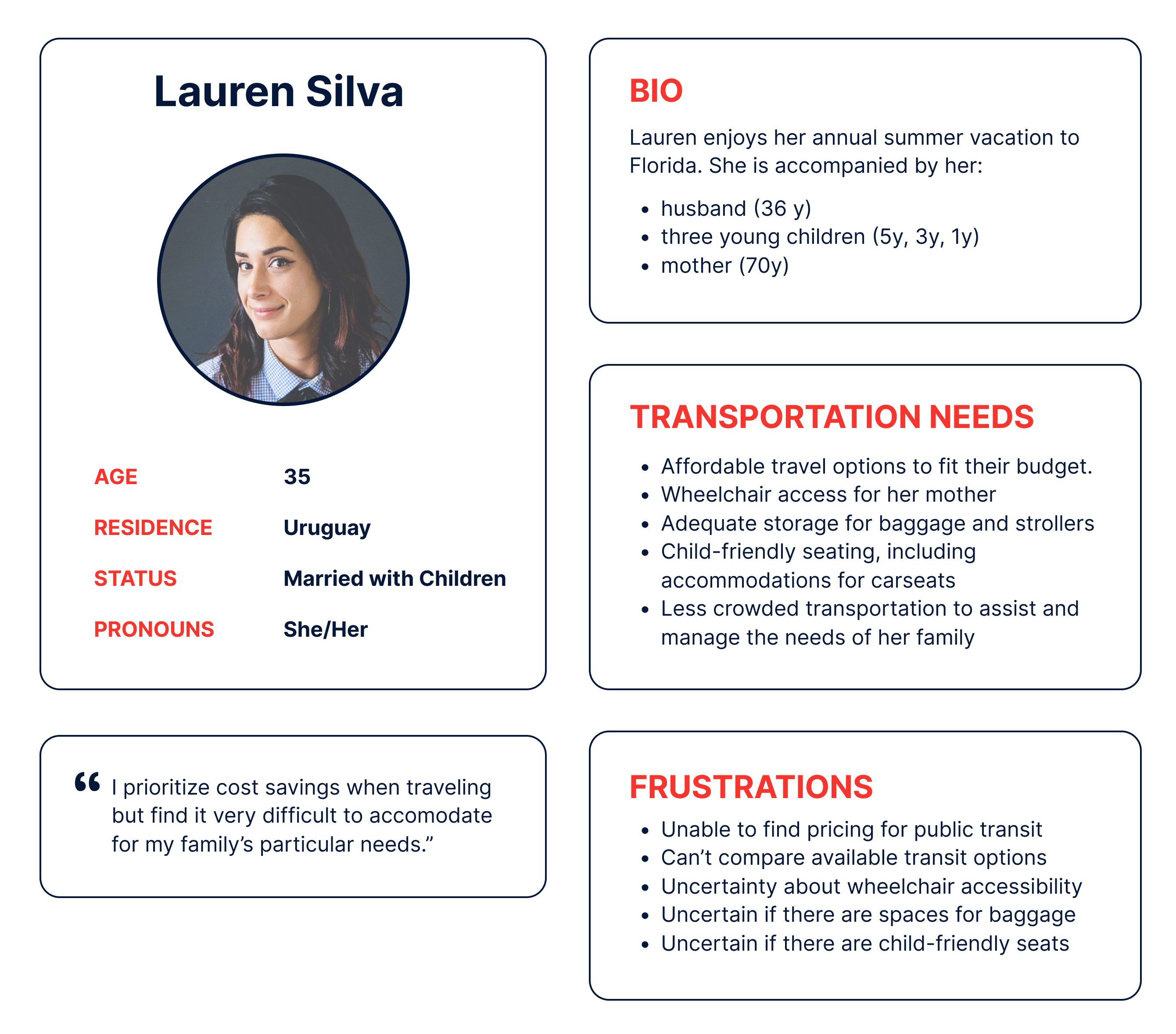
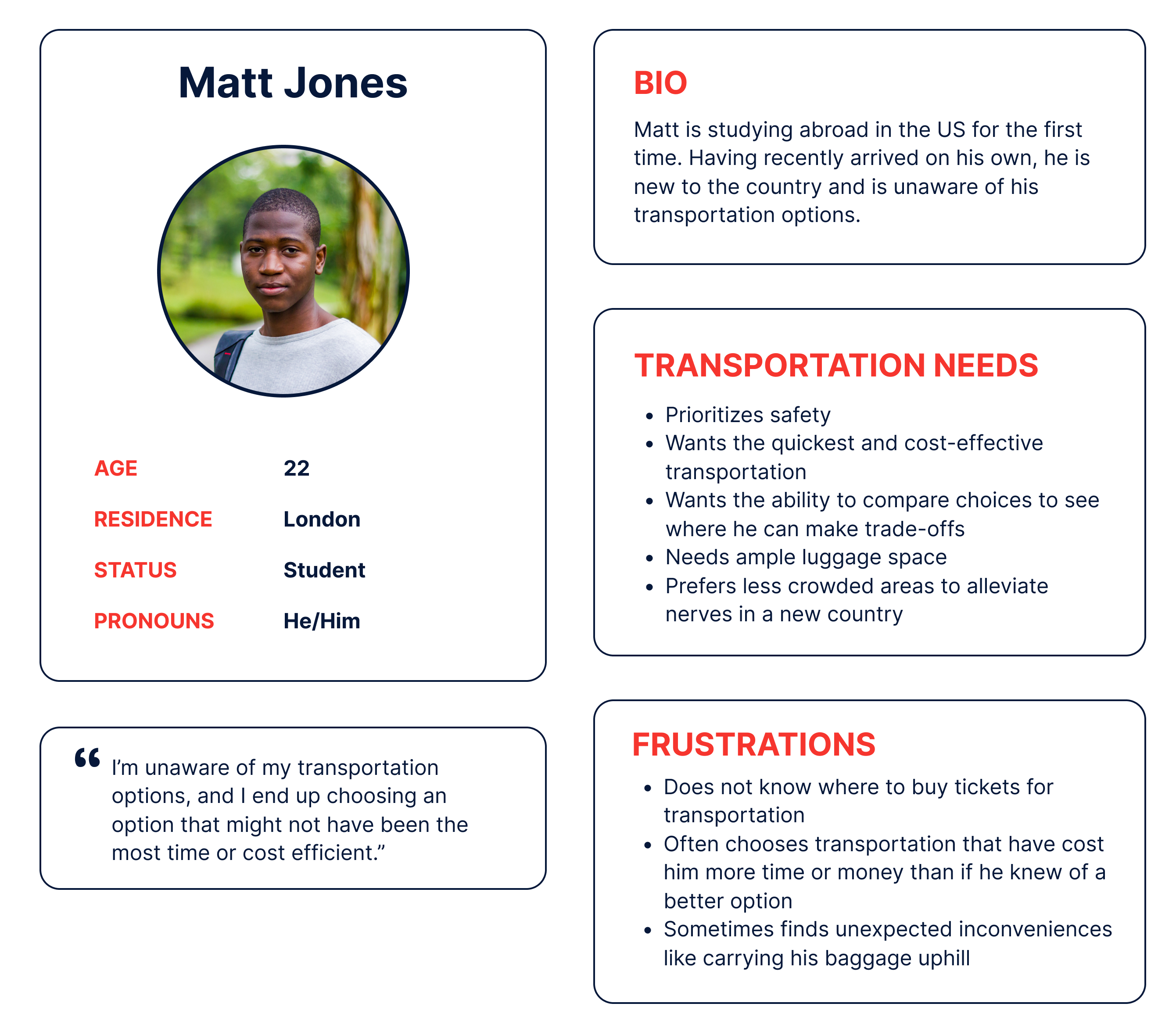
User Personas
Two user personas were chosen as the target audience based on survey data, interviews, and content research.
This helped contextualize the journey and understand needs.
User Journey
A user journey map outlines Lauren Silva’s experience—a mother of three traveling with her husband and mother—highlighting key milestones in her specific scenario.

Wireframes
I wanted to prioritize customizing the user’s travel situation and how inputting this information could enhance their navigation experience. In my low-fidelity wireframes, I first mapped out the user journey, considering the “happy paths” as well as edge cases. My overall aim was to present information efficiently without overwhelming the user.

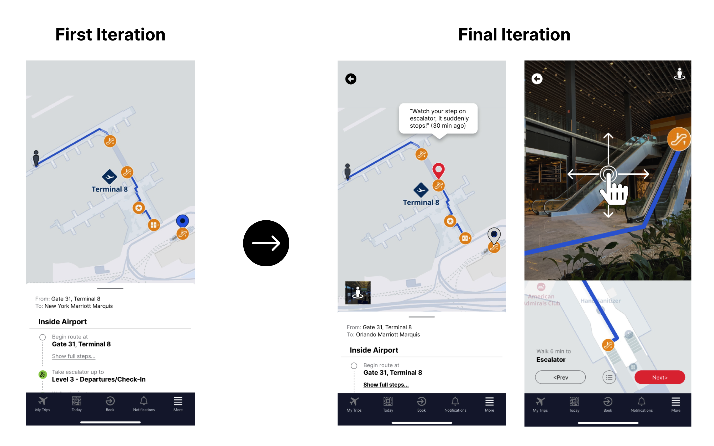
Process
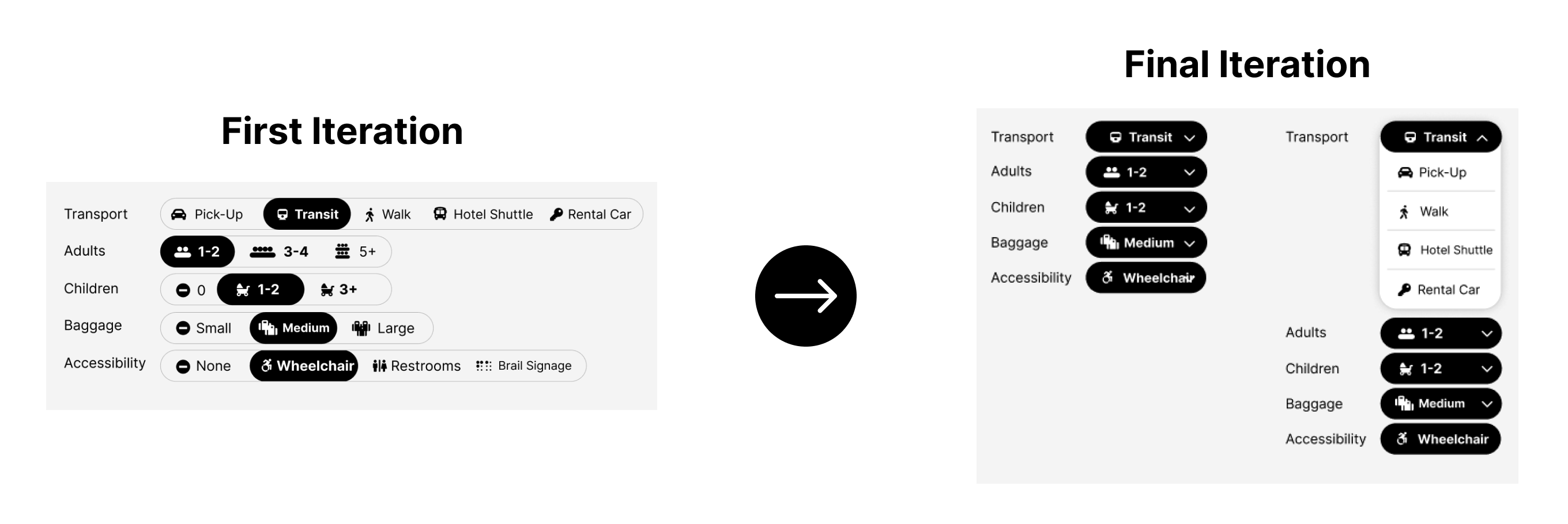
Initially, I based my design off of Google Maps and tried creating an improved version for air travelers. However, the first iteration didn’t clearly differentiate between the route options and didn’t highlight key information. In my final iteration, I streamlined the visuals to reduce clutter and emphasized the most important details to better meet travelers' needs.
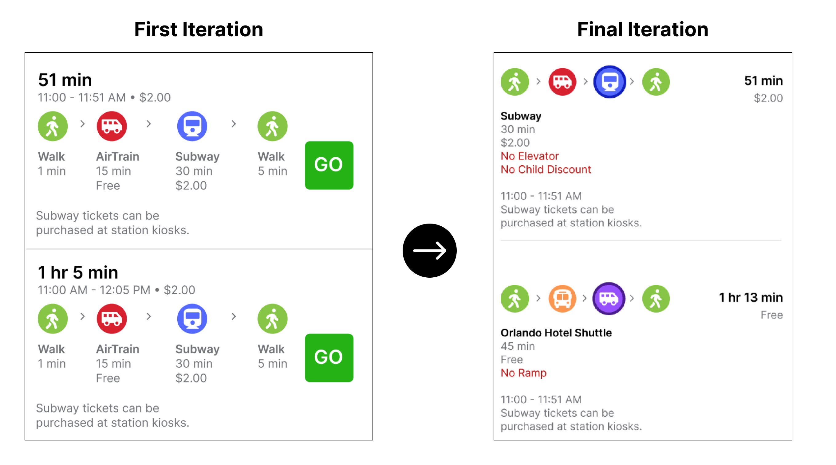
In the first iteration, all travel scenario options were displayed at once, which overwhelmed the user with unnecessary information. In the final version, I refined the interface by revealing options one after the other upon interaction, creating a cleaner and more focused user experience.
To enhance the navigation experience, an augmented reality feature was introduced, enabling users to view directions in real-world scale by simply holding up their phones. Additionally, users can access real-time updates from fellow users directly within the map.