Banking App | System Redesign
This project adds a visual and interactive tool to US Bank’s mobile app to help users understand credit card billing cycles and manage spending accordingly. More to this project coming soon!
UI/UX Design | Interaction Design
UI/UX Design | Interaction Design
Team
Individual
Individual
Duration
2 Weeks
Fall, 2023
2 Weeks
Fall, 2023
Programs
Figma
Figma

Problem Space
The design of US Bank’s mobile app makes it difficult to track spending and payment due dates for each credit card cycle. Because of the confusing UI design and common lack of understanding in credit card billing cycles, users have a hard time managing spending.
How might we make the credit card billing cycle easier to understand and help users managing their spending?
Affinity Diagraming
Researching user problems, areas of opportunity, types of users, and highly-rated designs.

User Pain Points

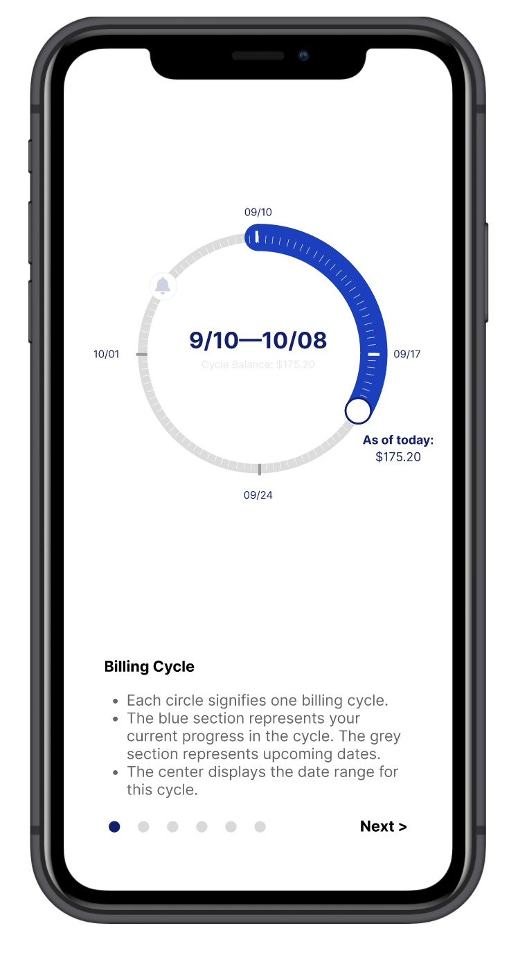
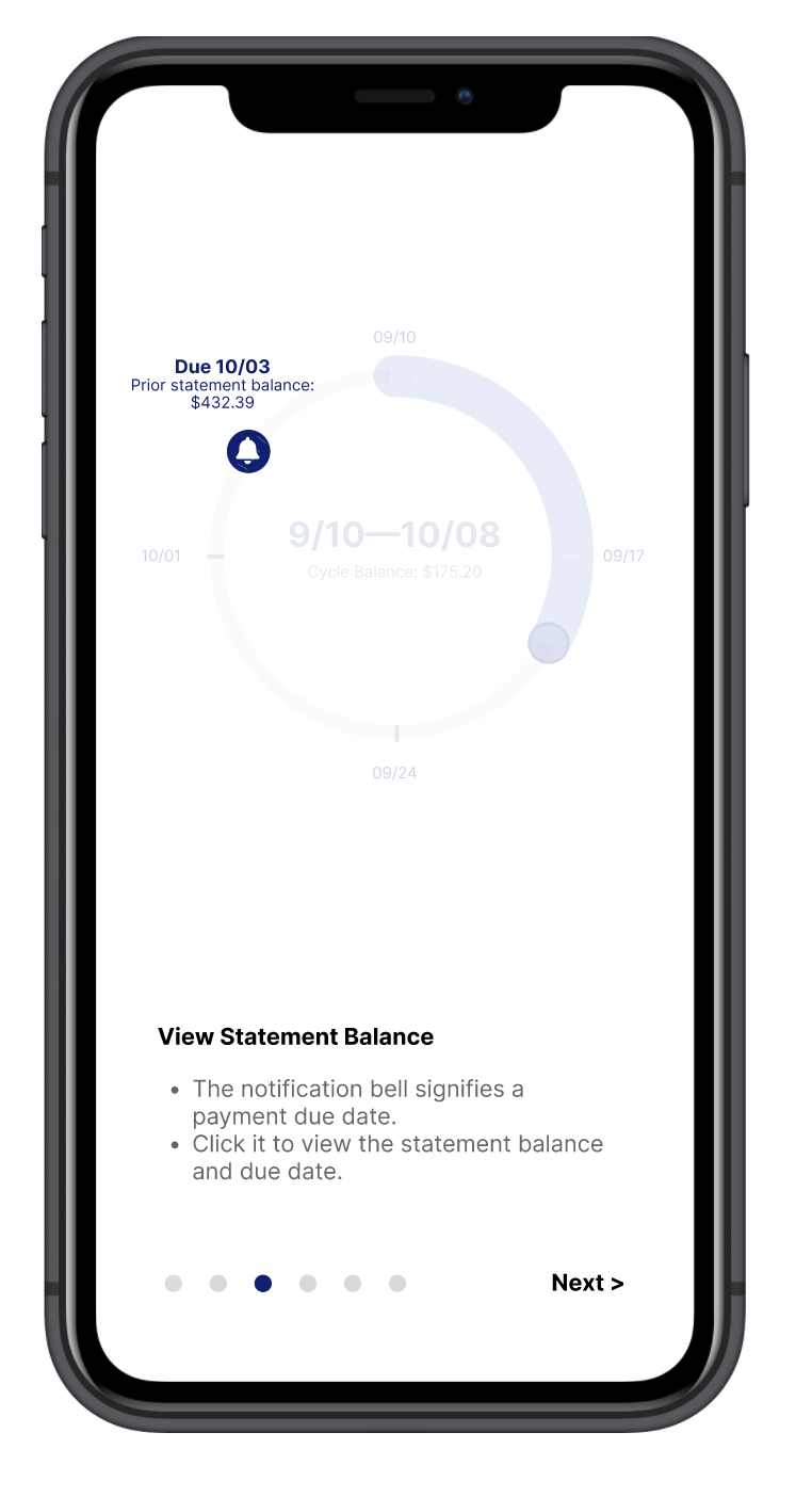
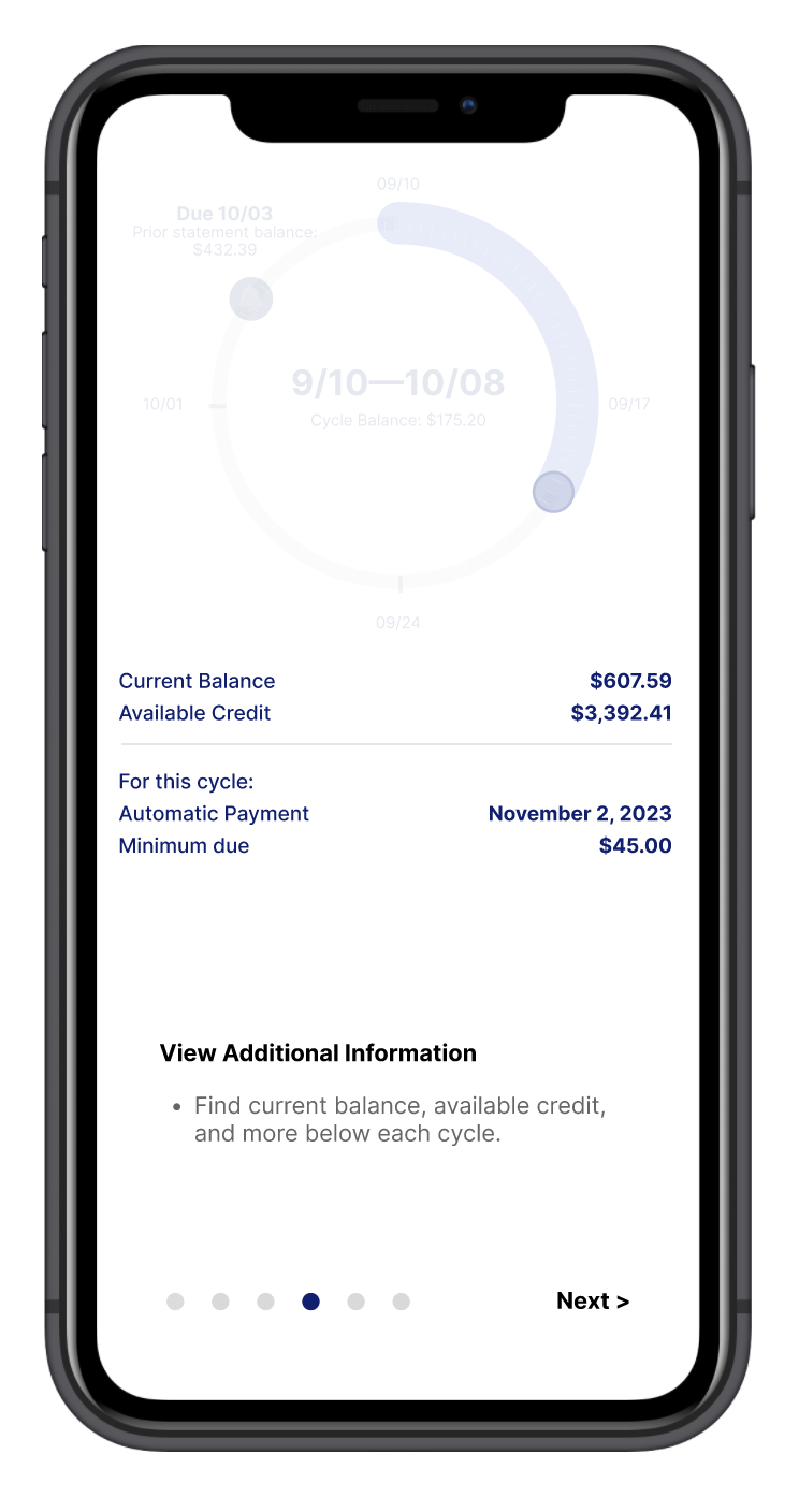
Onboarding Process
1. View individual billing cycles based on time.
2. View cycle balance from past dates.


3. Identify statement balance due date and amount.
4. View additional information below.
4. View additional information below.


5. Filter transactions by date or cycle.
6. View balances from past cycles.
6. View balances from past cycles.


Demonstration of Final Solution
Process
In the first iteration, users struggled to identify the circle being a representation of time instead of amount of money. Since the hierarchy of the design places emphasis on the numbers, users thought the circle was representing a spending goal.
Additionally, users weren’t aware that the open circle represented the due date for the upcoming statement balance.
Overall, the interface appeared overwhelming and unintuitive at first glance.


The design remained somewhat ambiguous, raising the question of recognition versus recall. Should the design immediately convey its functionality upon first glance, or should users be expected to remember how to use it?
This alternative solution incorporated a calendar, offering immediate recognition of time. However, it felt cluttered and lacked the simplicity of the other design.
This alternative solution incorporated a calendar, offering immediate recognition of time. However, it felt cluttered and lacked the simplicity of the other design.

Ultimately, the first solution (the circle) was chosen for its simplicity and user-friendly functionality. To address the initial ambiguity, an onboarding process was created to guide users on how to use this new design.

Wireframes

